

What 'Scandinavian Design' Actually Means — And Why Most People Get It Wrong
The real principles behind Scandinavian interiors have nothing to do with white walls and IKEA Billy shelves. What the style actually requires, and how to apply it properly.
Open Pinterest, search “Scandinavian interior,” and you will find thousands of images of the same room: white walls, white floors, a grey sofa, a single plant, and almost nothing else. Clean, minimal, and cold. This has become the default visual shorthand for Scandinavian design in most of the English-speaking internet, and it is almost entirely wrong.
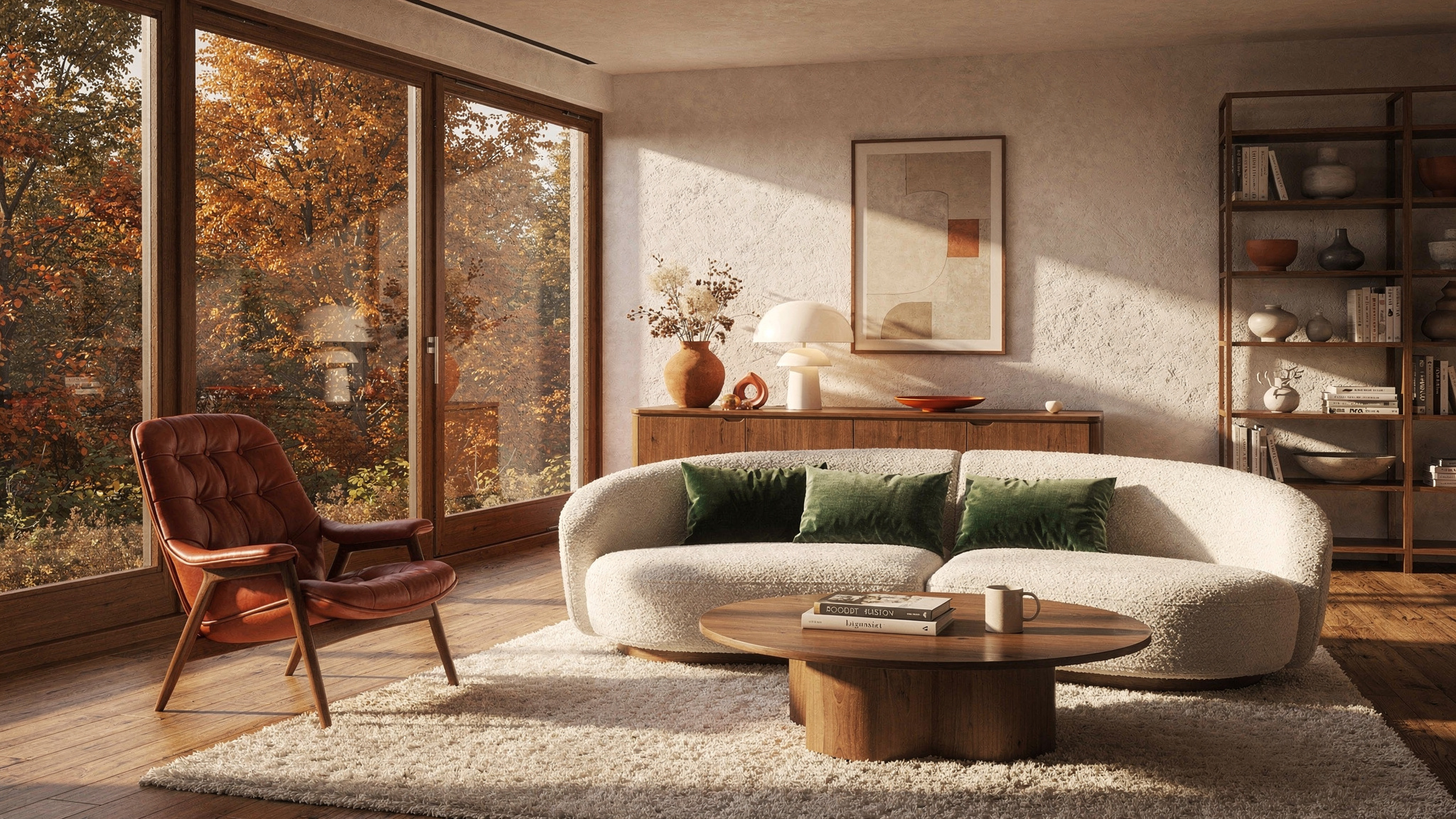
The real interiors of Copenhagen, Stockholm, and Helsinki look nothing like this. They are warm. They are layered. They contain colour — muted, considered colour, but colour nonetheless. The furniture is not cheap and flat-packed; it is well-made, often expensive, and chosen to last decades. The rooms are not empty; they are edited. The difference between “empty” and “edited” is the entire point of Scandinavian design, and missing it is why most attempts at the style end up looking like a show flat rather than a home.
Where the misunderstanding comes from
The confusion has a specific origin. In the early 2010s, the global interiors industry discovered Scandinavian design at approximately the same time as it discovered minimalism. The two were fused into a single visual trend — “Scandi minimalism” — that stripped out everything except the most surface-level elements: white, clean lines, emptiness. This was amplified by Instagram and Pinterest, where the cleanest, emptiest rooms performed best because they were easiest to photograph and most visually striking in a small square frame.
The result was a global misreading of an entire design tradition. What was actually a philosophy about craftsmanship, functionality, and democratic access to good design was reduced to an aesthetic of blankness. The rooms that went viral had the look of Scandinavian design but none of the substance — and when people tried to replicate them at home, they produced spaces that felt cold, impersonal, and oddly uncomfortable.
The real tradition is older, deeper, and far more interesting than “paint everything white and remove most of your possessions.”
The three actual principles
Scandinavian design rests on three principles that have nothing to do with colour or minimalism. Understanding them explains why the real thing feels warm and the imitation feels cold.
01 — Function is not optional, it is the entire point
The central tenet of Scandinavian design — the one that every other decision flows from — is that every object in a room must serve a purpose. Not a decorative purpose. A functional one. A chair exists to be sat in comfortably for long periods. A lamp exists to light a specific task or area. A shelf exists to hold things you use. If an object does not serve a clear function, it does not belong in the room.
This is often mistaken for minimalism, but the philosophy is fundamentally different. Minimalism says “less is more” — fewer things, more space, reduction as an end in itself. Scandinavian functionalism says “everything must work” — you can have as many things as you need, provided each one earns its place through use. A Scandinavian room with a wall of bookshelves filled with hundreds of books is not a contradiction; every book is there to be read. An empty room with a single decorative vase on the floor is not Scandinavian; the vase serves no function and the room serves no one.
This is why real Scandinavian homes often look more lived-in and layered than the Pinterest version. They contain blankets because Scandinavia is cold. They contain lamps — many lamps — because winter daylight lasts four hours in December and interior lighting is not a style choice but a survival necessity. They contain storage because functional rooms need places to put functional things. The “empty white room” interpretation removes all of this, which is why it fails.
02 — Materials must be honest
Scandinavian design has a deep commitment to natural materials used in their honest state — wood that looks like wood, leather that ages and patinas, wool and linen that soften with use, ceramic that shows the hand of the maker. Veneers, laminates, plastic made to look like wood, and high-gloss finishes are antithetical to the tradition.
This is partly philosophical — the Nordic design movements of the mid-20th century were explicitly reacting against industrialised imitation — and partly practical. In a dark, cold climate, natural materials provide warmth that synthetic surfaces cannot. A room clad in oak, furnished with leather and wool, lit by warm bulbs, feels fundamentally different from the same layout executed in white laminate and polyester, even if the shapes are identical.
The material commitment explains the price point that surprises people encountering real Scandinavian furniture for the first time. A Hans Wegner CH24 Wishbone chair costs €500–€700 because it is solid wood with a hand-woven paper cord seat, built to last fifty years. The IKEA interpretation costs €50 because it is made from different materials with a different lifespan. Both are valid purchases, but only one is Scandinavian design in the traditional sense. The tradition assumes you buy fewer things, each of higher quality, and keep them for a long time — which is the opposite of buying many cheap things and replacing them when trends change.
03 — Light is treated as a material, not a utility
This is the principle most consistently missed outside Scandinavia, and the one that makes the biggest difference.
In a climate where winter darkness begins at 3pm and sunrise does not arrive until 9am, artificial light is not background infrastructure — it is a primary design material, as important as the wood or the fabric. Scandinavian interiors are designed around light the way a kitchen is designed around the worktop: it is the element everything else relates to.
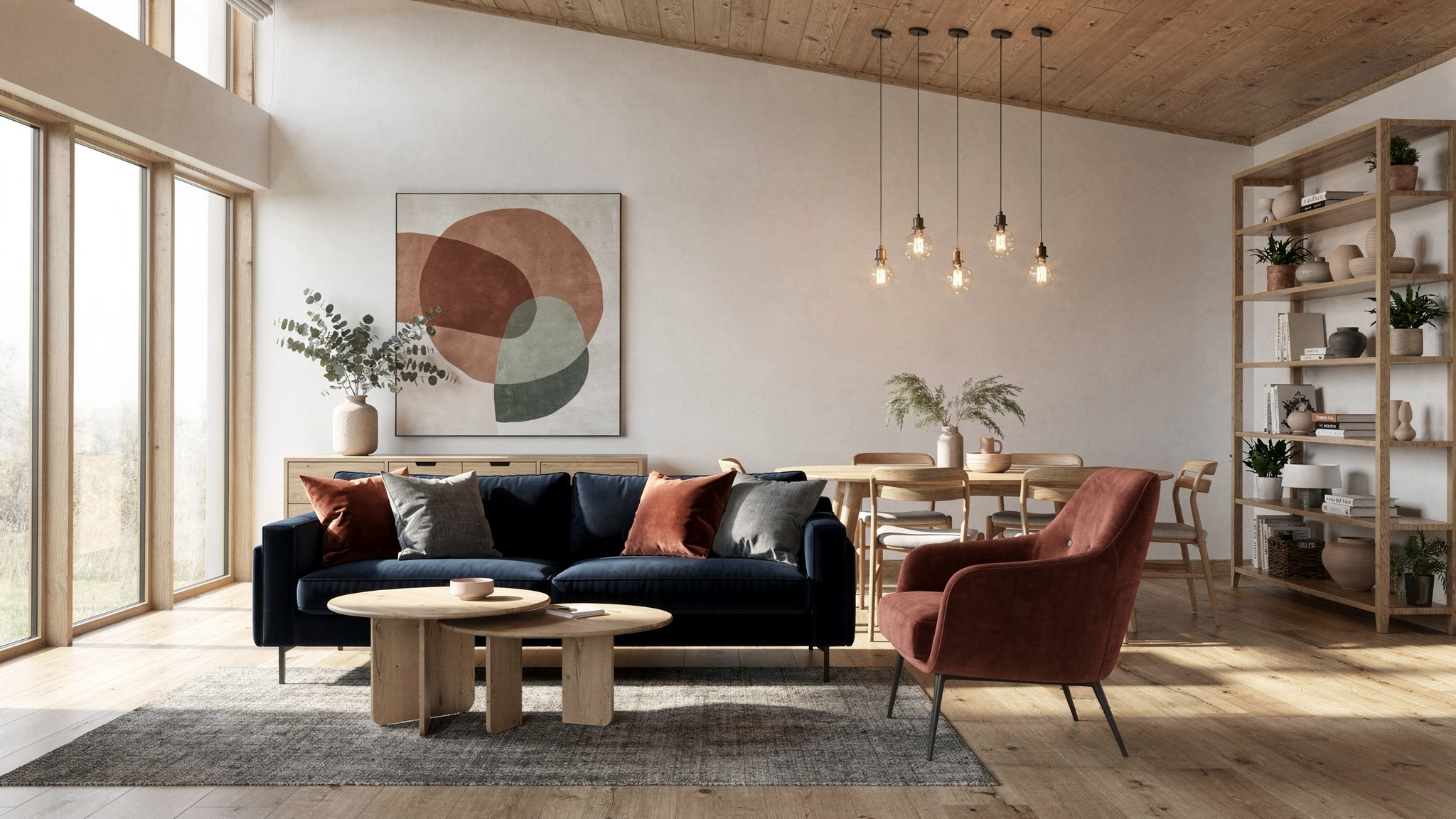
This manifests in specific ways. Pendant lamps are hung low over tables — much lower than in other European traditions, often 60–70 cm above the surface — creating intimate pools of warm light rather than general overhead illumination. Every seating area has its own lamp. Candles are used daily, not reserved for special occasions; the average Danish household burns more candles per capita than any other country in Europe. Windows are left uncovered or dressed with sheer linen rather than heavy curtains, because every minute of natural light is valuable and not to be blocked.
The result is rooms that glow. Not uniformly lit, not bright, but warm and layered with multiple sources of light at different heights and intensities. This is the warmth that people feel in real Scandinavian interiors and cannot reproduce at home — not because they lack the right furniture, but because they have a single ceiling light on full brightness and no candles.
What the colour palette actually is
The all-white myth is the most damaging misconception. White walls are common in Scandinavia — but they are warm whites, not brilliant whites, and they serve a specific purpose: maximising the reflection of scarce natural light during winter months. The walls are white for functional reasons, not aesthetic ones.
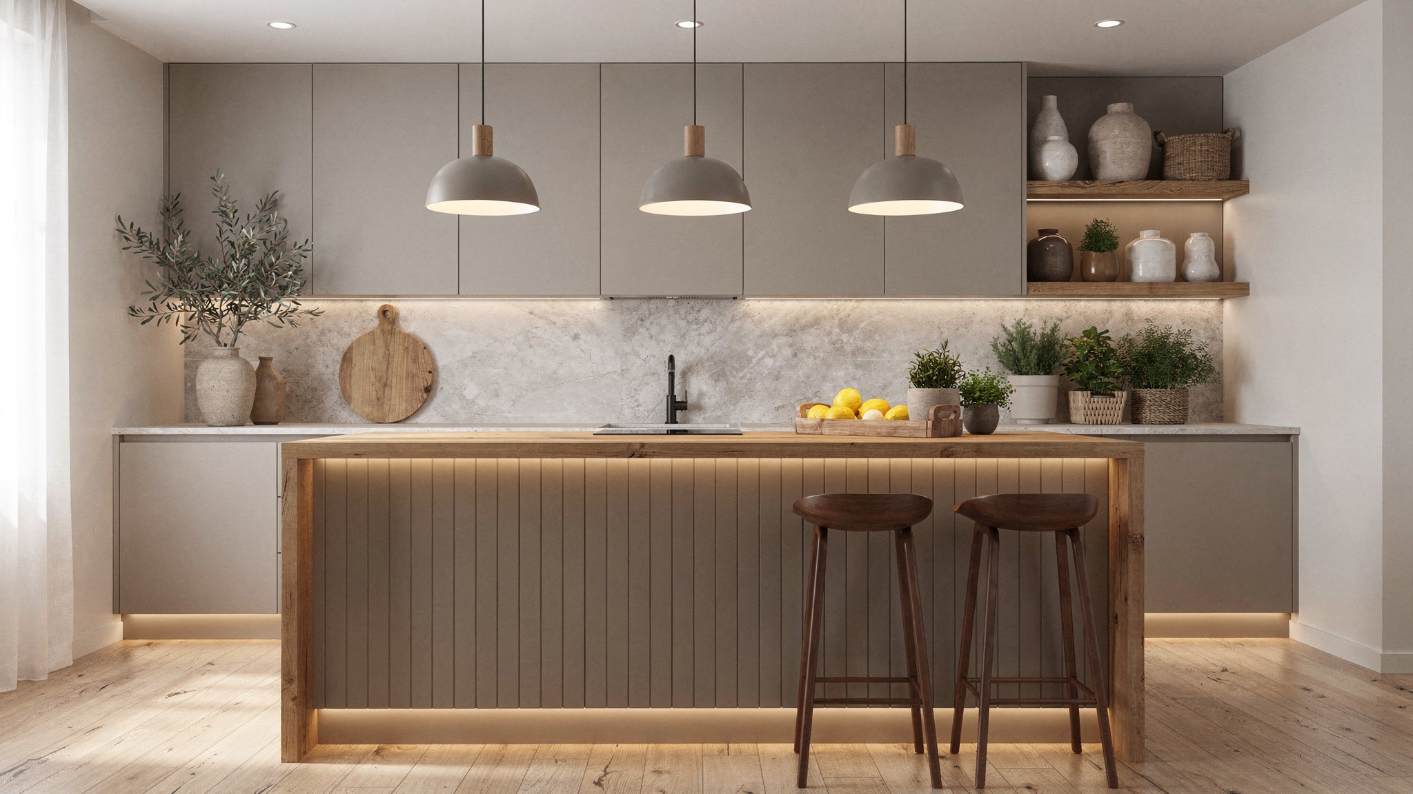
Beyond the walls, Scandinavian interiors use colour freely — but the palette is muted, nature-derived, and deliberately restrained. Think of the colours you see in a Nordic landscape in autumn: deep forest green, warm terracotta, dusty blue, ochre, soft grey-brown, muted rust, and the warm tones of natural wood and leather. These are the colours that appear in real Scandinavian homes, and they appear with more confidence and frequency than the Pinterest version suggests.
The test for whether a colour belongs in a Scandinavian palette: could you find it in nature in southern Scandinavia between September and March? If yes, it works. Neon, primary brights, and high-contrast patterns do not.
Hygge is a result, not a method
The Danish word “hygge” — roughly translated as a feeling of cosy contentment — has been commercialised into a product category. Shops sell “hygge candles,” “hygge blankets,” and “hygge gift sets” as if the feeling can be purchased in a box. It cannot.
Hygge is not a thing you buy. It is the atmosphere that results from getting the other principles right. A room with honest materials, warm light, comfortable functional furniture, and an appropriate amount of personal objects naturally produces hygge. It is the feeling of sitting in a well-designed room with a warm drink, good light, and nothing that irritates the eye or the body. You cannot achieve it by adding a single candle to a cold, poorly lit room with uncomfortable furniture, no matter what the candle costs or what the label says.
This matters because people often approach Scandinavian design from the hygge end — buying accessories and soft furnishings in an attempt to create warmth — when the actual sequence runs in the opposite direction. Fix the light first. Choose honest materials second. Make the furniture functional and comfortable third. The warmth follows. Accessories are the final layer, not the foundation.
How to actually apply it: a practical starting point
If you want to move a room towards genuine Scandinavian design rather than the Pinterest imitation, these are the changes that matter, in order of impact.
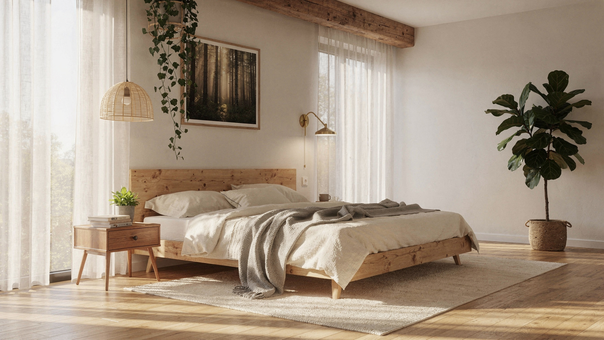
First, the light. Replace all bulbs with 2700 K warm white. Add a table lamp or floor lamp to every seating area. Hang a pendant low over the dining table if you have one. Buy candles — real ones, not LED — and use them daily in the evening. This single change will shift the room from clinical to warm, and it costs under €50.
Second, the materials. Look at the surfaces you touch most often. If they are synthetic — polyester throws, plastic storage, laminate surfaces — consider replacing the most visible ones with natural alternatives over time. A wool throw instead of polyester. A wooden tray instead of plastic. A linen cushion cover instead of printed cotton-poly. This does not need to happen all at once. Scandinavian rooms are assembled over years.
Third, edit rather than empty. Go through the room and remove anything that serves no function and gives you no pleasure. This is not about creating emptiness; it is about ensuring everything that remains has earned its place. A shelf of books you love is perfectly Scandinavian. A shelf of decorative objects bought to fill a shelf is not. The distinction is use and intention.
Fourth, add warmth through colour and texture. A muted ochre cushion. A terracotta pot on the windowsill. A deep green throw over the sofa arm. These are not decorative additions in the trivial sense — they are the natural-palette colour that real Scandinavian rooms use to counterbalance all the light wood and pale walls. Without them, the room reads as cold. With them, it reads as considered.
The cost question
Genuine Scandinavian design has a reputation for being expensive, and at the high end — original Fritz Hansen, Carl Hansen, Muuto — it genuinely is. A single dining chair can cost €400–€800. A pendant light from Louis Poulsen runs €300–€600. These prices reflect the materials and craftsmanship the tradition demands.
But the philosophy itself is not inherently expensive. The principle of buying fewer, better things and keeping them for decades is actually cheaper over a lifetime than buying cheap furniture every three to five years. A solid oak dining table that costs €600 and lasts thirty years is less expensive per year of use than a €150 laminate table replaced four times. The Scandinavian approach asks you to spend more once and less often — which requires patience but not wealth.
For an achievable entry point: IKEA’s solid wood and natural material ranges (look for real oak, birch, or ash in the description, not “oak effect”), second-hand mid-century Scandinavian furniture (which is widely available in Europe and often cheaper than new high-street equivalents), and the lighting changes described above. A room can move convincingly toward the real tradition for €200–€500 invested gradually over six months, provided the changes are principled rather than decorative.
Scandinavian design is not a colour scheme. It is not a mood board. It is a set of principles about function, materials, light, and honest simplicity that happen to produce rooms which feel warm, calm, and deeply liveable. The Pinterest version strips out the principles and keeps only the surface — which is why it looks clean in photos and feels cold in person. Put the principles back, and the warmth follows.