

Jewel-Tone Corners: How to Add Old-World Drama Without Redoing a Whole Room
Burgundy velvet, brass and candlelight — how to bring jewel-tone, old-world drama into one corner of a room without repainting or redoing anything else.
Most people who like the idea of a jewel-tone room never actually do it, because committing an entire living room to burgundy or emerald feels like a decision you cannot walk back from. The fix is to stop thinking about the room and start thinking about the corner. One seating area — a chair, a lamp, a small table, treated with real colour and real texture — delivers the drama in a dose that reads as considered rather than irreversible. It costs one chair and one lamp, not a redecoration, and if it does not work, undoing it is a Saturday afternoon.
Why a Corner, Not the Whole Room
A fully saturated room and a fully saturated corner produce different reactions for a simple reason: scale changes how colour reads. Spread across four walls, deep burgundy or forest green can tip into heavy or dated, and it is expensive to reverse if it does not work. Contained to one chair, one lamp and the wall directly behind them, the same colour reads as a considered accent — the kind of detail that makes people ask where a piece came from rather than wonder why the room feels dark. This is close to how stylists actually test a bold colour before committing a whole space to it: small, reversible, load-bearing enough to prove the idea works.
The Velvet Question
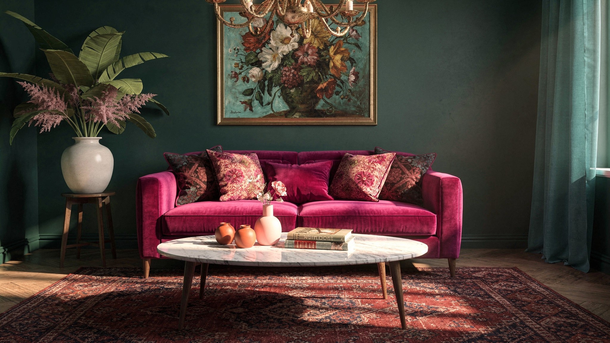
Velvet is what makes a jewel tone feel expensive rather than flat, because the fabric’s pile catches light differently depending on the angle you view it from — a plain cotton or linen in the same colour will never do this. Cotton velvet is the better long-term choice: it wears in rather than out, develops a soft sheen with use, and holds colour better than synthetic blends. A cotton velvet armchair typically runs €300 to €600; a synthetic or velvet-blend version can be found from €150 to €300 and is a reasonable way to test the idea before spending more.
The spending rule for this project is simple: put the budget into the one hero piece — the chair — and save on everything layered around it. A cushion in a remnant of real velvet, sourced separately from the chair itself, gets you the same tactile richness for a fraction of the cost of upholstering a whole seat.
Brass, Not Everything Gold
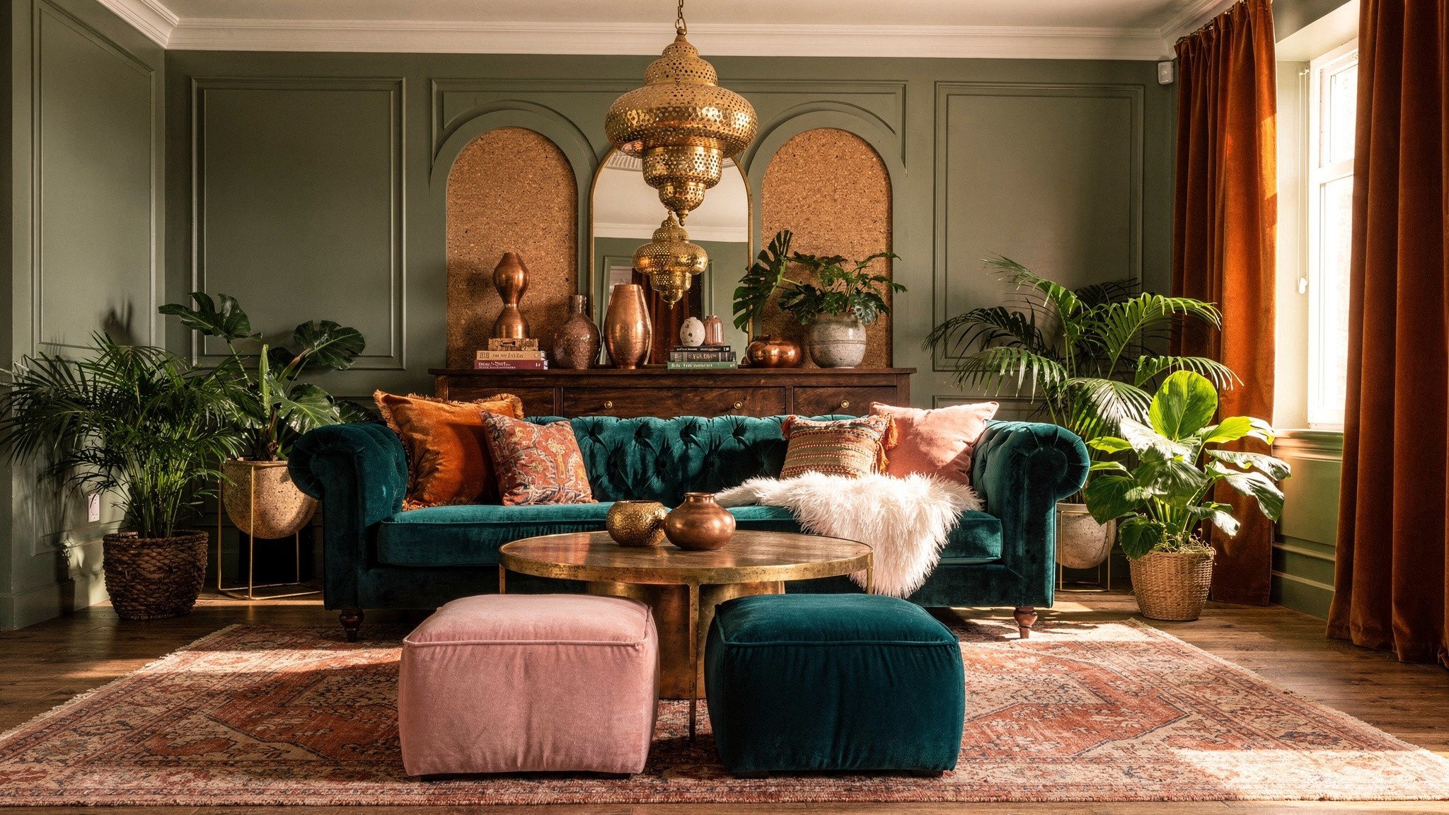
One warm metal, used consistently, is what pulls a jewel-tone corner together. Brass is the classic pairing because its warmth sits naturally against deep reds, greens and plums, but the finish matters more than the metal itself. Polished, lacquered brass reads as new and slightly corporate; unlacquered or aged brass, which develops a soft patina over months of handling, reads as the “old-world” quality the whole look is aiming for. If a piece only comes in the shiny lacquered finish, light abrasion with fine steel wool on the high points will start to break down the sheen.
Keep silver, chrome and nickel out of the same sightline entirely. Two warm-toned jewel colours and one cool metal is the fastest way to make a considered corner look like an accidental mix of leftover furniture.
Building the Corner
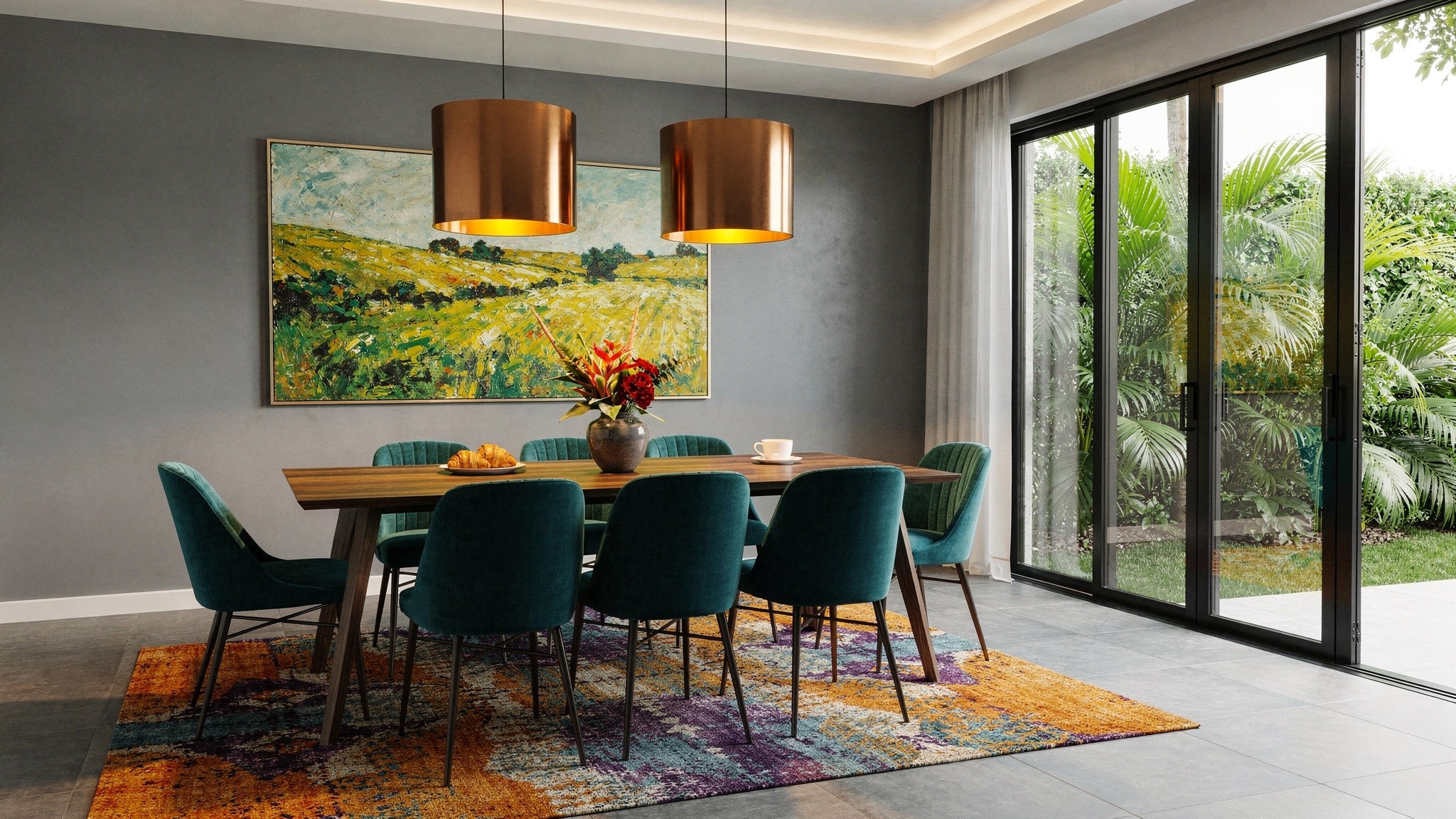
A jewel-tone corner is the rare decorating move that gets more interesting the smaller it stays. One chair, one lamp, one dark surface and the discipline to stop there is what makes it read as a considered detail rather than a phase you might regret. If it works in the corner, the rest of the room can follow at whatever pace feels right — and if it does not, nothing else in the house has to change.