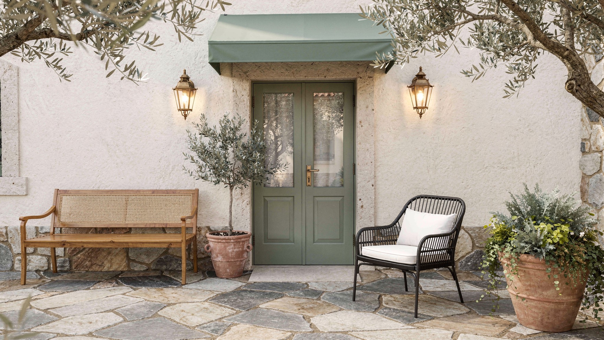
Your front door in deep forest green against pale render, brass hardware catching afternoon light Save

Front Door Colour Guide: How to Choose One That Actually Suits Your House

Six colour families that work across European house types, how to read your brick or render before choosing, real paint costs, and the three mistakes that make a freshly painted door look wrong within a year.

The front door is the one part of a house that gets judged in complete isolation. Nobody sees your kitchen worktop before they’ve decided how they feel about your home — but the door is the first thing, often the only thing, a visitor or a buyer or a passer-by actually looks at. That disproportion is exactly why the colour decision feels so much harder than painting any other single surface in the house, and why most people either freeze and repaint it the same safe colour it already was, or chase whatever shade is trending that year without checking if it suits the building it’s attached to.

It does suit some buildings and not others. A colour that looks editorial on a Georgian townhouse can look like a mistake on a 1990s semi. This guide works through how to actually choose — starting with the house, not the paint chart.


Read your house before you read a colour chart

Before any colour decision, look at three things you already have: the brick or render tone, the roof colour, and the era of the building. These three are fixed. The door colour is the only variable, which means its job is to work with what’s already there, not to be chosen on its own merits.

Warm red or orange-toned brick pulls naturally toward greens, blues and black — colours with enough depth to hold their own against a warm wall without fighting it. Pale render or stone pulls toward almost anything, which is both a gift and a trap: with no strong undertone to react against, it’s easy to choose a colour that’s simply wrong for the house’s era rather than wrong for its materials. Grey or buff brick is the hardest base to work with — it has a cooler undertone than most people register at a glance, and warm colours like terracotta can look slightly muddy against it where they’d sing against red brick.

The roof matters more than people expect. A dark slate or charcoal roof creates a visual anchor that a black or deep navy door echoes naturally. A warm terracotta tile roof does the same for a terracotta or burnt-orange door. When the door colour picks up a tone already present somewhere else on the building, the whole facade reads as considered rather than decorated.

Worth knowing If your house is in a conservation area or listed, check before you buy paint. Many heritage zones across Europe restrict exterior door colours to an approved palette, and the fine for repainting outside it is rarely worth the saving on a tin of trade paint.

Six colour families that actually work
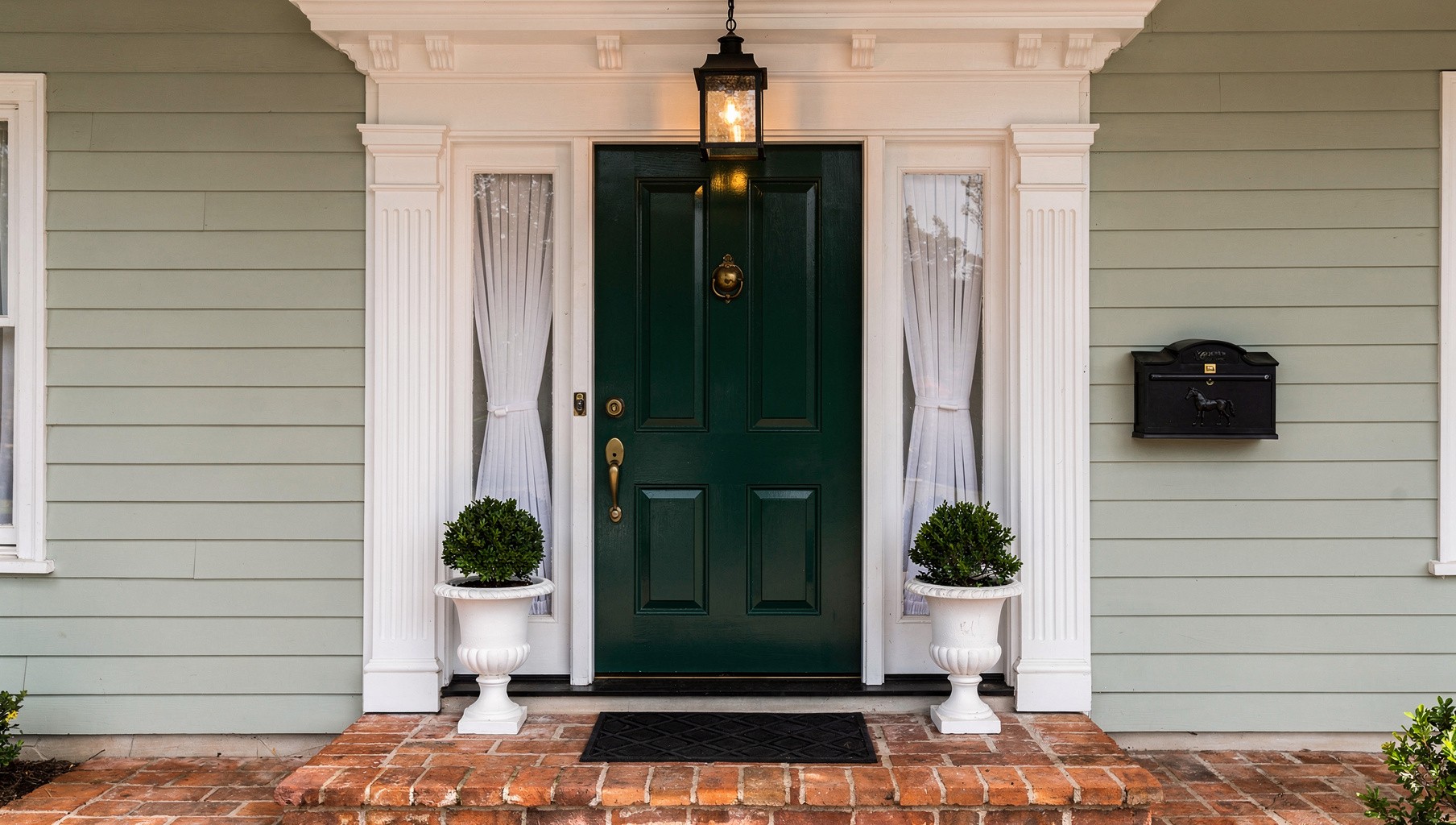
Your front door in matte black with a brass letterbox and house number, set against pale grey render

Heritage Green
The safest colour that still reads as a deliberate choice. Works on almost any brick tone and most render colours, which is why it shows up on more front doors than any other shade in Europe.
Pairs with: brass or aged bronze hardware, red or buff brick, slate or stone
Off-Black / Charcoal
True black can look severe in flat daylight. A soft black with a hint of warm or green undertone reads as sophisticated rather than harsh, and is far more forgiving against pale render.
Pairs with: chrome, matte black or unlacquered brass, pale grey or white render
Deep Navy
Reads almost black from a distance but reveals genuine colour up close, which gives it more warmth than black without losing any of the formality. The most reliable choice for period houses with red brick.
Pairs with: polished or aged brass, red brick, white window frames
Terracotta / Burnt Sienna
The warmest option on this list, and the one most often dismissed without being tried. Against a buff stone or warm render, it photographs as one continuous warm palette rather than a contrasting accent.
Pairs with: matte black or bronze hardware, buff stone, terracotta roof tile
Soft Sage / Muted Olive
Quieter and greyer than heritage green, which makes it the better choice for contemporary builds and rendered new-builds where a fully saturated colour would feel out of step with the architecture.
Pairs with: brushed brass or black, white or pale grey render, timber cladding
Statement Yellow / Red
The riskiest family and, when it works, the most memorable. Best suited to small cottage-style doors, terrace houses in a row of similarly bold neighbours, or houses where the rest of the facade is deliberately restrained.
Pairs with: black hardware, white trim, plain render or whitewashed stone

What it costs

Your front door mid-repaint, masking tape along the frame and a tin of exterior eggshell open on the step

Repainting an existing door is one of the cheapest transformations available in a home, which is part of why colour matters so much here — the leverage is enormous relative to the spend.

DIY
€35–70
A tin of trade-quality exterior eggshell or satinwood (1L covers most standard doors with two coats), sandpaper, masking tape and a decent brush. The paint itself is the only real cost.
Premium paint
€90–140
Designer exterior ranges with better UV stability and deeper pigment load. The finish lasts noticeably longer in direct sun and the colour stays true rather than chalking after two summers.
Professional
€150–320
A sprayed factory-style finish, usually done with the door removed from its hinges. The flattest, most even result available, and the right call if the existing paint is failing badly or the door is hardwood worth protecting properly.

If the door itself needs replacing rather than repainting — rotten timber, a failed composite skin, single glazing you’re upgrading — a new composite door supplied and fitted runs roughly €900 to €2,500 depending on size, glazing and hardware, most of which now comes pre-finished in a baked-on colour rather than requiring site paint at all.


Finish and hardware

Watch out for
A south-facing door takes far more direct UV exposure than any other painted surface on the house. Standard interior-grade paint, or even budget exterior paint, will chalk and fade within a year in strong sun. Pay for a paint specifically rated for UV stability on doors that face south or west, and expect to repaint roughly every five to seven years regardless of quality.

Satin or eggshell is the standard finish for a reason — it has enough sheen to wipe clean but doesn’t show every brushstroke and surface imperfection the way full gloss does. Full gloss looks striking in good light but is unforgiving of an imperfect surface underneath, and shows dust and water spots far more readily.

Hardware finish should echo something else in the colour scheme rather than being chosen in isolation. Brass against a dark door reads warm and traditional. Matte black against a pale render reads contemporary and quiet. Chrome is the most neutral option and the easiest to get wrong — it can read cold against a warm-toned door and brick combination, so test it in person before committing to a full hardware set.


Three mistakes

01
Mistake
Choosing the colour from a phone screen, not the actual door in actual light
A colour swatch photographed under shop lighting and viewed on a phone screen bears only a loose relationship to how that paint will look on your specific door, facing your specific direction, under your region's light. Buy a sample pot, paint a piece of card the size of a door panel, and prop it against the actual door at different times of day before ordering the full tin.
02
Mistake
Using the wrong paint type for the door material
Timber doors need a breathable, flexible exterior paint that moves with the wood as it expands and contracts with humidity — a rigid paint will crack along the grain within a season. Composite and uPVC doors need a specialist acrylic formulated to bond to the factory finish; standard wood paint will peel off a uPVC surface almost immediately. Check the product is rated for your exact door material before buying.
03
Mistake
Chasing the trend instead of the house's era
A near-black, ultra-matte door looks intentional on a clean-lined new-build and slightly wrong on an ornate Victorian door with period mouldings, where the depth and detail of the carving gets lost against such a flat, dark surface. Before following a colour because it's everywhere this year, check whether it actually has a track record on houses built in your home's era — heritage greens and navys earned their staying power precisely because they work across more architectural periods than most trend colours ever will.

The right front door colour does two jobs at once: it has to hold its own as a focal point and it has to look like it was always meant to be there, not added afterward. Start from the brick, the render, the roof and the era of the house rather than from a colour you’ve seen elsewhere, test it properly in your own light, and use a paint rated for the material and the exposure your door actually gets. Get those three things right and almost any colour on this list will work — get them wrong and even the most expensive designer paint won’t save it.