

Colour Drenching: How to Paint Walls, Ceiling and Woodwork the Same Colour
What colour drenching is, why it works, which colours suit which rooms, and the practical steps to achieve the immersive single-colour look without the room feeling oppressive.
There is a moment in every colour-drenching project where you stand in the room with the first wall done, the second wall half-done, and the certainty that you have made a terrible mistake. The colour looks too strong. The room feels too intense. The ceiling — still white at this point — reads as a lid sitting on top of a dark box. This moment passes. It passes because the effect of colour drenching only works when it is complete. A room where the walls are painted a rich green but the ceiling remains white is not a colour-drenched room — it is a room with green walls and a white ceiling, and those are entirely different things.
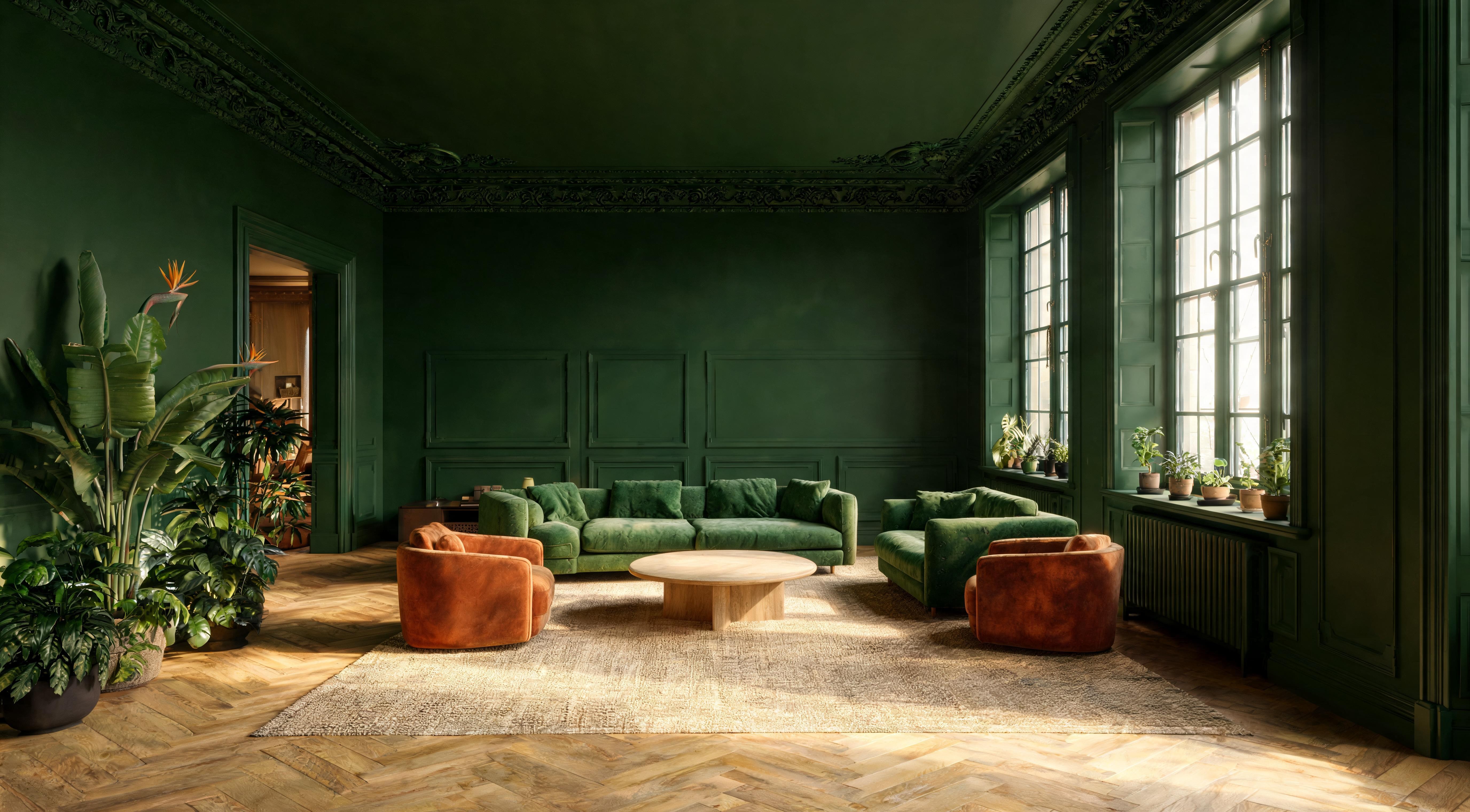
Colour drenching means painting every surface in a room the same colour: walls, ceiling, woodwork, skirting boards, door frames, sometimes the door itself. The result is a space where colour becomes atmosphere rather than decoration — where the room reads as a single immersive environment rather than a collection of differently coloured surfaces.
Why It Works
The reason colour drenching looks more considered than a standard painted room is that it eliminates visual interruption. In a conventionally painted room — dark walls, white ceiling, white skirting — the eye registers each junction between colours as a line. The top of the wall is a horizontal line. The skirting is another. Door frames and window frames create rectangular interruptions. These lines define the geometry of the room and make you conscious of its dimensions: how wide it is, how tall, how long.
When every surface is the same colour, those lines disappear. The ceiling flows into the walls. The skirting disappears into the base of the wall. The room stops reading as a box and starts reading as a space. Counterintuitively, this makes small rooms feel larger — because the dimensions that define smallness are no longer visible — and makes large rooms feel more intimate, because the absence of contrast draws the surfaces closer.
Which Colours Work
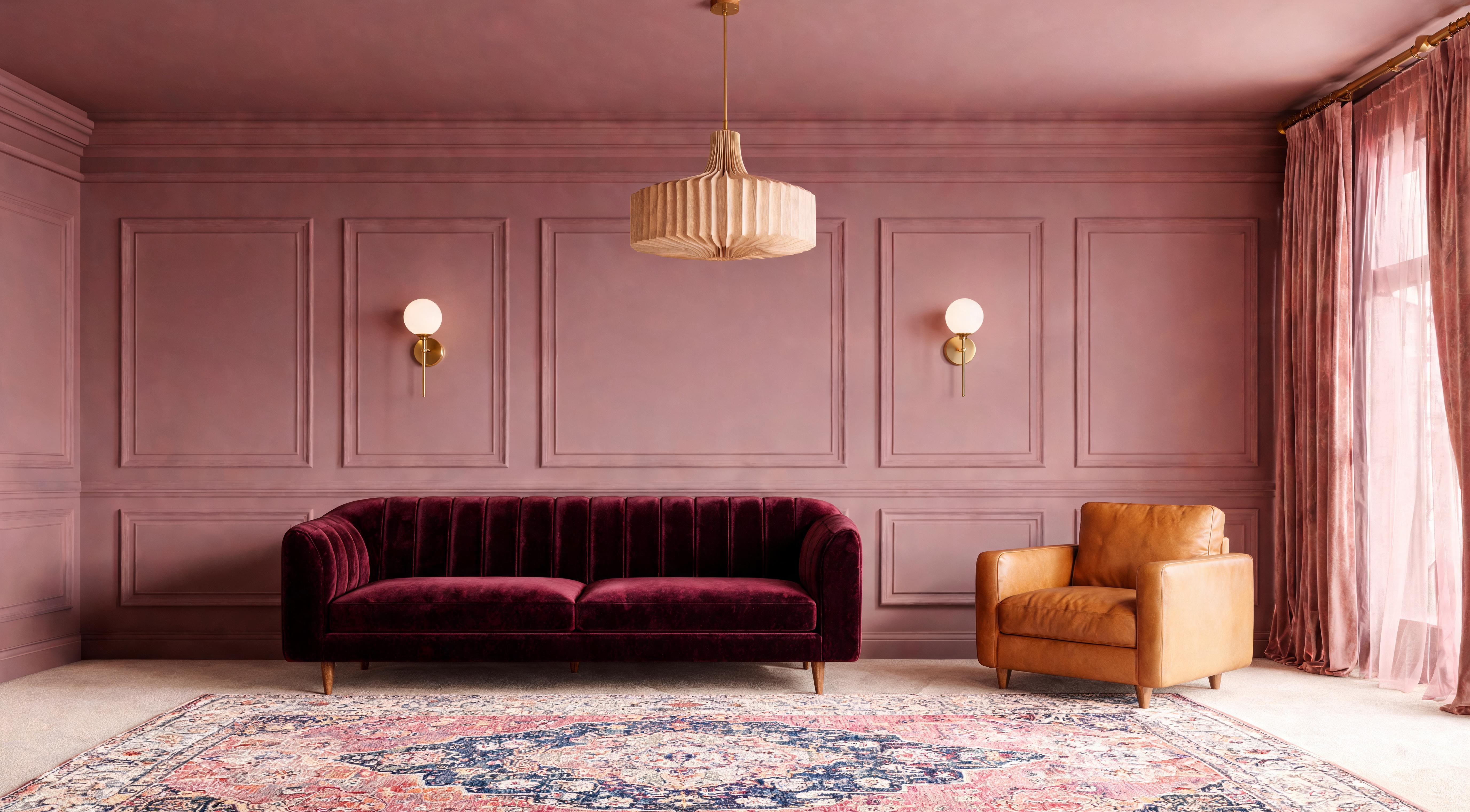
Not every colour suits every room for drenching — and not every colour suits drenching at all. The colours that work best have enough depth to sustain the immersive effect across every surface without becoming fatiguing. Very bright or very saturated colours — vivid yellow, electric blue, strong orange — tend to overwhelm when applied to every surface. The colours that work are those with enough grey or earth in them to sit quietly at high saturation.
Which Rooms Suit It
Colour drenching works hardest in enclosed rooms with a clear purpose — rooms you go to, not rooms you pass through. A bedroom drenched in deep green or warm grey becomes a deliberate retreat from the rest of the house. A dining room drenched in navy or charcoal becomes atmospheric for evening meals. A study drenched in any dark colour becomes a focused, library-like environment.
The rooms where drenching is less successful are open-plan spaces — particularly those connected to kitchens — where the volume of painted surface is large enough that the colour can become overwhelming. In an open-plan living-kitchen, a drenched living room end with a differently painted kitchen end is a better approach than drenching the entire space.
Watch out for
The bathroom is the one room where colour drenching frequently fails. Bathrooms have more surface types than any other room — tile, grout, sanitaryware, mirrors, glass — and the white surfaces of a bath, basin and toilet interrupt the drenched effect in a way that furniture in a bedroom or living room does not. If you want colour in a bathroom, tile is a better approach than paint.
The Finish Question
Painting every surface the same colour does not mean painting every surface with the same finish. The standard approach — and the one used by most professional decorators — is three finishes within the same colour:
This variation in finish within the same colour is what distinguishes a professionally executed drench from a DIY attempt. When the ceiling, walls and woodwork share the same colour but vary slightly in sheen, the surfaces retain their identity — you can still see where the wall meets the ceiling, where the skirting begins — but the transitions are soft rather than hard. The room has structure without visible lines.
Brands and Practicalities
The reason Farrow & Ball and Little Greene dominate the colour-drenching trend is not just marketing — it is that their colour ranges are designed with enough complexity in the pigment mix that a single colour sustains interest across a large surface area. A simple green from a standard paint brand can read as flat and monotonous when applied floor to ceiling. A complex green with grey and blue undertones shifts visually as the light changes through the day, which is what prevents a drenched room from feeling like a painted box.
The affordable route — Dulux Heritage, Dulux trade, or Leyland trade — is viable for drenching if you choose colours carefully. Avoid the standard consumer colour cards, which tend toward primary colours that lack the complexity needed for full-room coverage. The Heritage and trade ranges have more nuanced options. Buying a tester pot and painting a full A3 swatch on the wall — not a small patch — is essential regardless of brand. Assess it at morning, midday and evening light before committing.
How to Paint a Drenched Room
The order of painting matters in a colour-drenched room more than in a standard room, because the transitions between surfaces need to be clean despite being the same colour. The standard order is: ceiling first, walls second, woodwork last. This allows you to cut in cleanly where each surface meets the next without worrying about drips onto a finished surface below.
Paint the ceiling in dead matt. Allow it to dry fully. Then paint the walls, cutting in carefully where the wall meets the ceiling — the colour is the same but the finish difference means a messy junction is visible. Then paint the woodwork in eggshell or satin, using a smaller brush for the edges where wood meets wall.
Watch out for
Leaving the ceiling white while you decide. The white ceiling is the thing that makes a drenched room look wrong — paint it first and the walls will immediately look right. People who test the walls and leave the ceiling as a last step almost always lose confidence before they finish. Commit to the ceiling on day one.
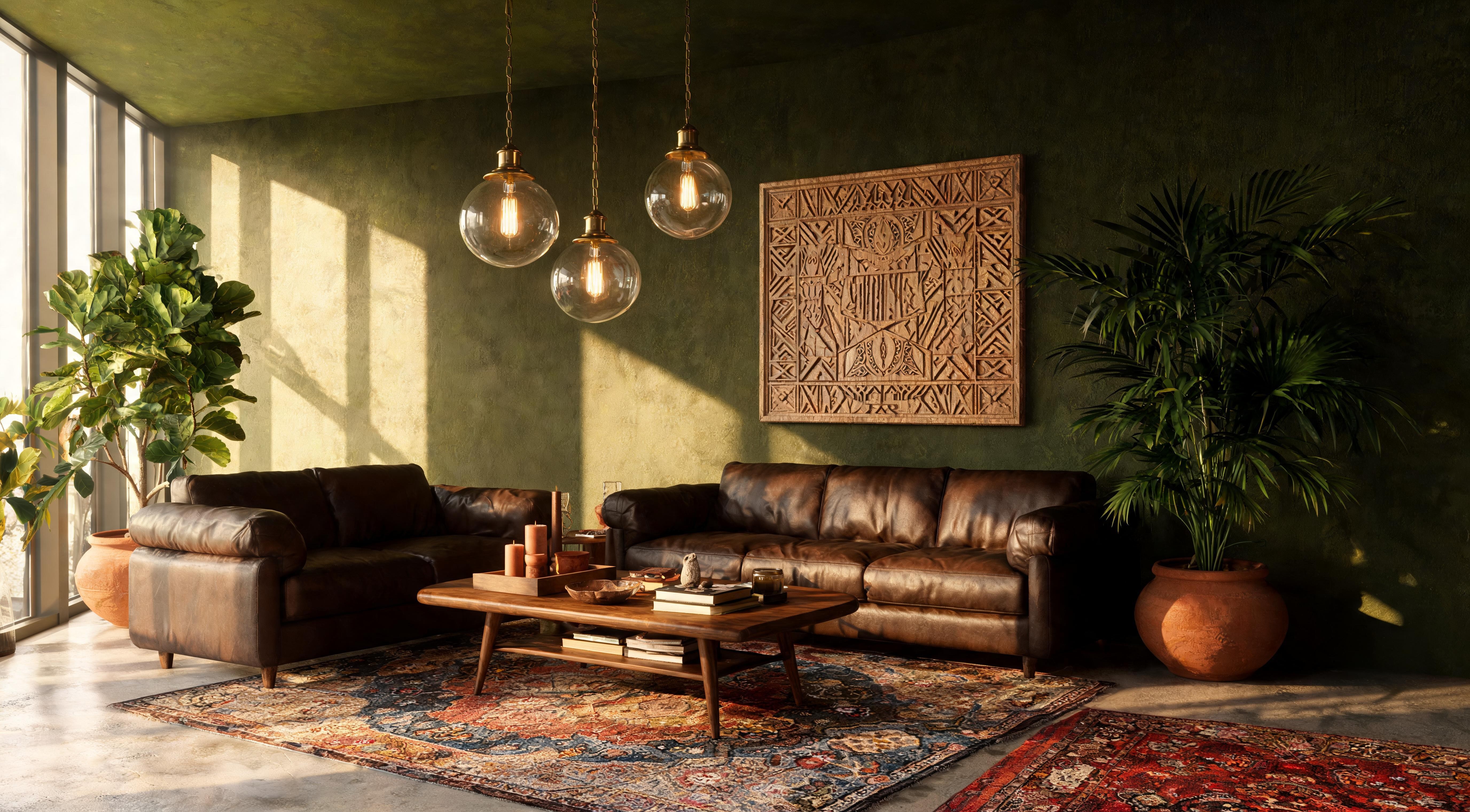
Colour drenching is the simplest way to make a room look like it was designed by someone who meant it. The commitment is a single colour, a weekend, and the willingness to paint the ceiling. The cost is one to three tins of paint and the confidence to keep going when the first wall looks too strong. The result is a room that feels like a deliberate environment rather than four walls with furniture in.